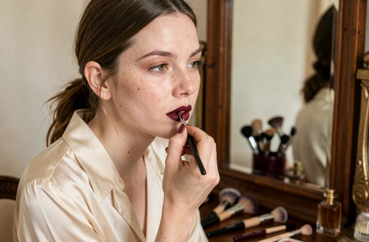
We’ve all experienced the same thing: falling for a raspberry lipstick in a store, applying it in the bathroom mirror, and discovering that it looks purple or makes our complexion look waxy.
On fair skin, the difference between the shade tested on your hand and how it looks on your lips is often more noticeable than you might think. The reason has less to do with the color itself than with how light interacts with your skin’s undertone—a factor most guides gloss over without explaining how to check it in practice.
Test lipstick on your lips, not your hand
The back of your hand doesn’t have the same pigmentation or blood flow as your lips. Lip skin is thinner and more vascular, and its natural color (pink, mauve, or peach) changes how the lipstick looks. A beige nude may look neutral on a fair hand, but turn grayish on naturally pink lips.
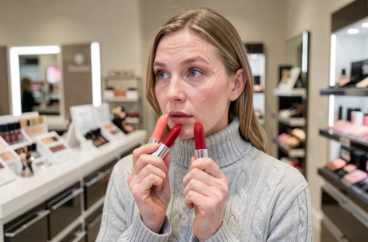
For a reliable preview, apply the lipstick directly to your lower lip in natural light. Store lighting, which is often yellow or cool white, can distort how warm and cool shades appear. The color can look completely different near a window or once you step outside.
The finish also plays a role: the same carmine-red pigment will look more intense in a matte formula (which absorbs light) and softer in a satin formula (which reflects it). On fair skin, a satin finish softens vivid shades and helps prevent the “cut-out lips” effect that matte lipstick can emphasize when there’s a strong contrast between the lips and the rest of the face.
Choosing a lipstick for fair skin therefore means looking beyond the shade chart and taking light, finish, and your lips’ natural pigmentation into account.
Fair skin undertones: what really changes when choosing a shade
Skin tone describes how light or deep your complexion is, not its undertone. Two equally fair complexions can have opposite undertones: one may lean golden (warm), another pink (cool), while a third may not clearly lean either way (neutral). Don’t confuse fair skin with a cool undertone—it’s the first mistake to avoid, as it can lead you to choose unflattering shades.
How to identify your undertone accurately
The wrist-vein test (blue for cool, green for warm) is a useful first check, but it isn’t always easy to read on very fair skin, where veins can appear both blue and green. A more telling test is to compare two fabrics near your face in daylight:
- A pure white fabric and an ivory one. If pure white brightens your face, your undertone is probably cool. If ivory is more flattering, it’s probably warm.
- A gold and a silver piece of jewelry worn in the same spot. Gold brings out warm undertones, while silver complements cool ones.
- Your tanning response can also help: warm undertones tend to tan golden, while cool undertones tend to turn red before developing a tan.
Shades to choose based on your undertone
For a cool undertone, look for raspberry pinks, blue-based reds (such as cherry red), and mauves. These pigments have a blue or violet base that harmonizes with the pink tones in your skin.
For a warm undertone, peach, coral, orange-red, and apricot nude shades work better. Their yellow or orange base complements your skin’s natural golden tones without clashing.
A neutral undertone gives you more flexibility: you can explore both color families, paying more attention to the finish and intensity than to the color base.
Hair and eye color: a secondary but useful factor
Undertone remains the main factor. Hair and eye color can then help you refine your choice, especially when you’re deciding between two similar shades.
With fair skin and brown or dark brown hair, there’s already a strong natural contrast. You can wear bold reds (carmine, garnet) without your lips looking out of proportion. With fair skin and blonde or red hair, the contrast is softer: mid-tone shades such as tea rose or soft coral create balance without overpowering the rest of your face.
Blue or green eyes are enhanced by warm-based reds (orange, brick), which create complementary contrast on the color wheel. Brown or hazel eyes work well with both cool and warm shades, giving you more options.

Skin sensitivity and ingredients: an often-overlooked factor
The skin on your lips doesn’t have a protective outer layer as thick as the rest of your face. It absorbs more of a lipstick’s ingredients, making sensitivity a more important consideration than it is with eyeshadow or blush.
If a shade causes tingling, unusual dryness, or minor flaking, the problem isn’t the color but the formula. Certain synthetic pigments, preservatives, or waxes can trigger individual reactions. Testing a new formula on a small area of your lip for a few hours before using it regularly can help you identify a sensitivity without compromising comfort.
In Europe, lipsticks are regulated as cosmetic products, with lists of permitted ingredients and labeling requirements. Discussions about restricting certain substances (including PFAS in cosmetics) are ongoing at the European level, but no definitive rules specifically targeting lipsticks have been introduced yet. Checking the INCI ingredient list on the packaging remains the most reliable way to spot an ingredient you know you react to.
Three lipstick combinations for fair skin
Rather than offering a long list, here are three combinations that work in most situations:
- Fair skin with a cool undertone, brown hair, light eyes: satin raspberry pink. The blue-based pink complements the undertone, while the satin finish softens the intensity.
- Fair skin with a warm undertone, blonde or red hair, green or hazel eyes: coral or peach nude. The orange base complements your skin’s golden tones without making your face look washed out.
- Fair skin with a neutral undertone, brown hair, brown eyes: classic red that isn’t too blue or too orange, in a cream finish. A “true” red works with neutral undertones because it doesn’t lean warm or cool.
The final factor to keep in mind is the occasion. A light nude is enough for everyday wear, while an intense red is best saved for moments when you’re going for a bolder makeup look. The perfect color on paper may not suit the occasion—that’s when personal preference takes over from color theory.